Brand: ActBlue
Business Objective: Optimized insights feature to create user engagement
Role: Lead Product Designer
This feature is a space where ActBlue donors can get insights about their contributions. While the insights page provided some information about donor’s contributions. It wasn’t creating any engagement, neither people found it useful.
Goal: Convert the current Insights page into a engaging feature that reflects the donor’s impact. Make interface available for mobile and web.
RESEARCH
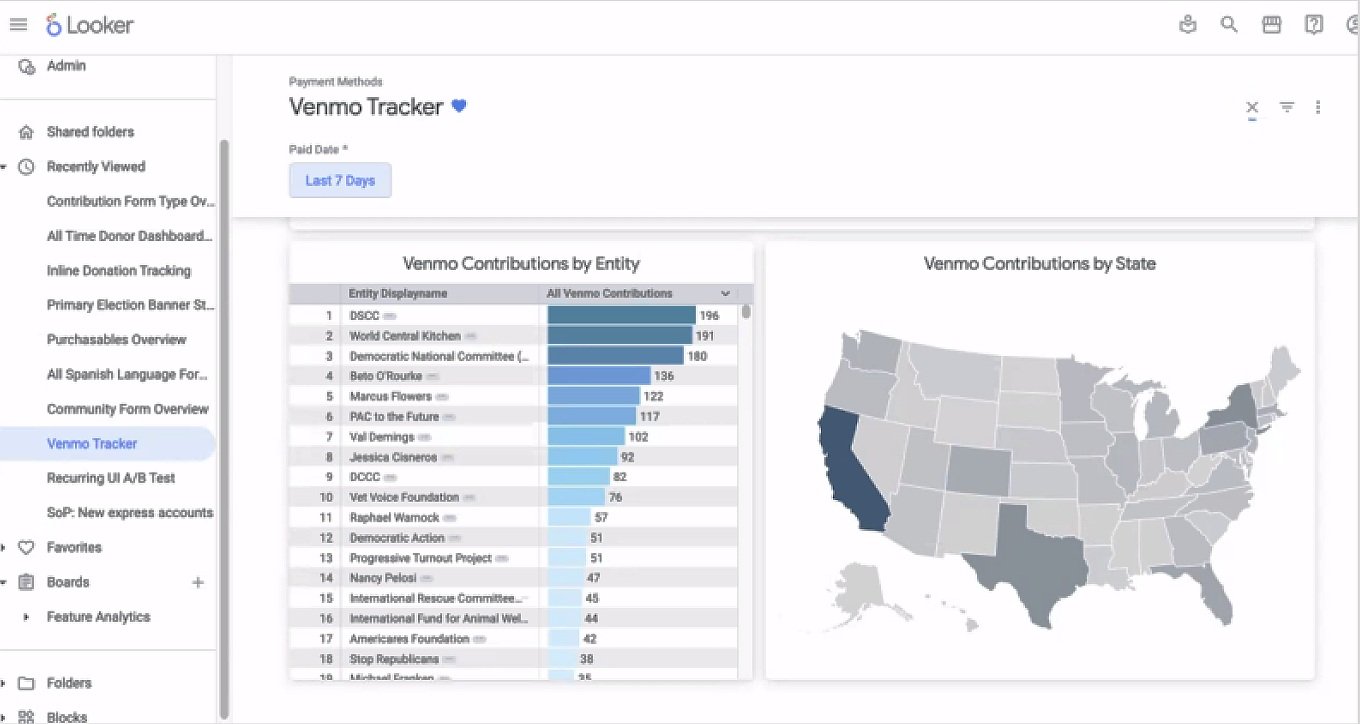
During my research I ran a comparative analysis. Some of the companies I looked at were AmazonSmile and Venmo Tracker. While analyzing their approach, I kept the following questions in mind:
What else is out there?
What do they offer?
How could we stand ourselves apart?

Using the current (then) design, I conducted a usability testing with 20 users. I focused on the following prompts:
How do you use this feature?
What do you like or dislike about the insights page?
Narrate what you observe
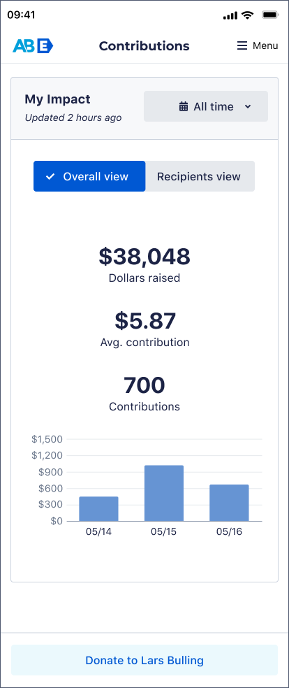
Previous design wasn’t available for mobile
FEATURE IDEATION
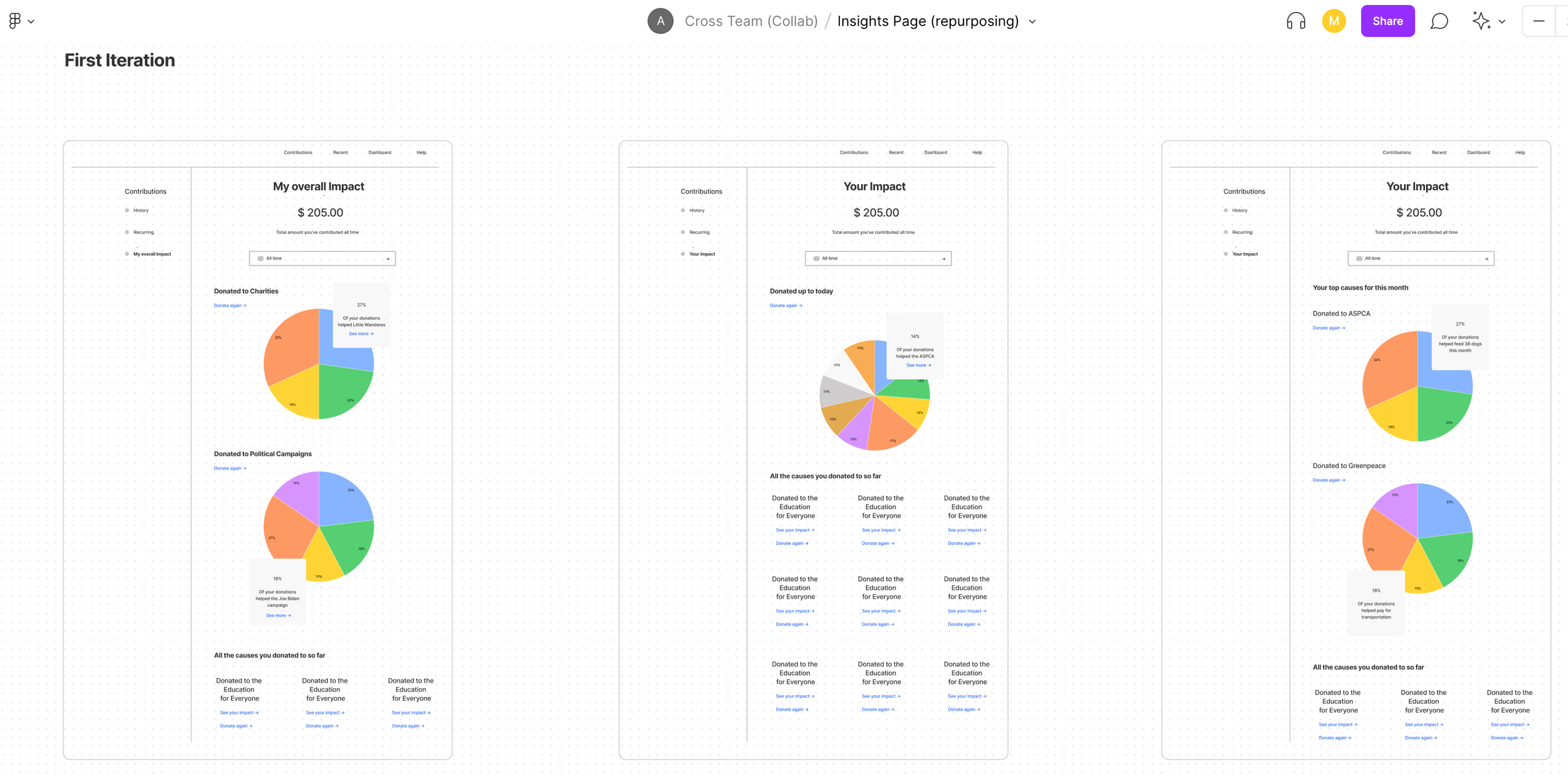
We leaned heavily on graphs layouts during the ideation process. I took into consideration optimization suggestions, deeper donation breakdowns and other ways to show our donors contribution’s data.
Brainstorming done in FigJam board
WIREFRAMES
While working in the wireframes, I decided to change the name of the page to My Impact. I realized this name reflected better the content and was more personalized. Our new feature focused on the priorities of the user, which was to easily analyze their donation’s impact.
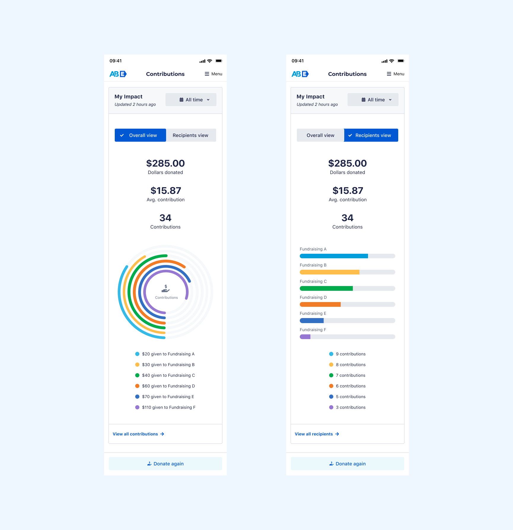
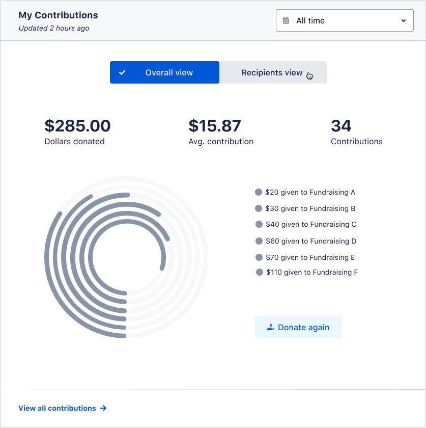
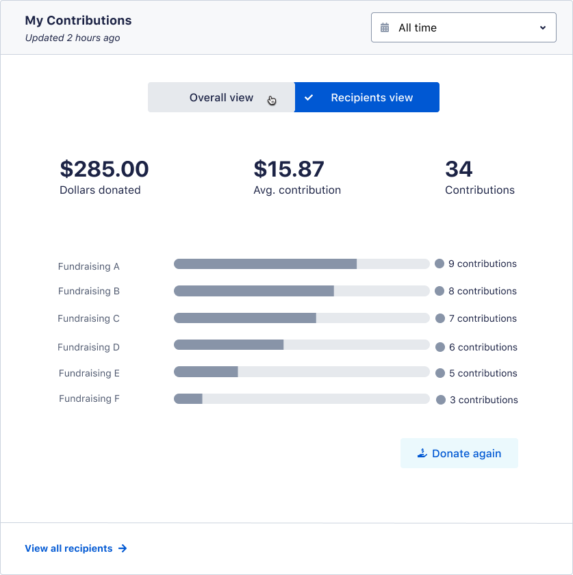
After having a few iterations and validation sessions, I landed with the design below. This user interface, not only represented the donors contributions as an overall view, but also provided a view to their recipients. People could now make donations directly from here, at either view.
Overall view
Recipient view
VISUAL DESIGN
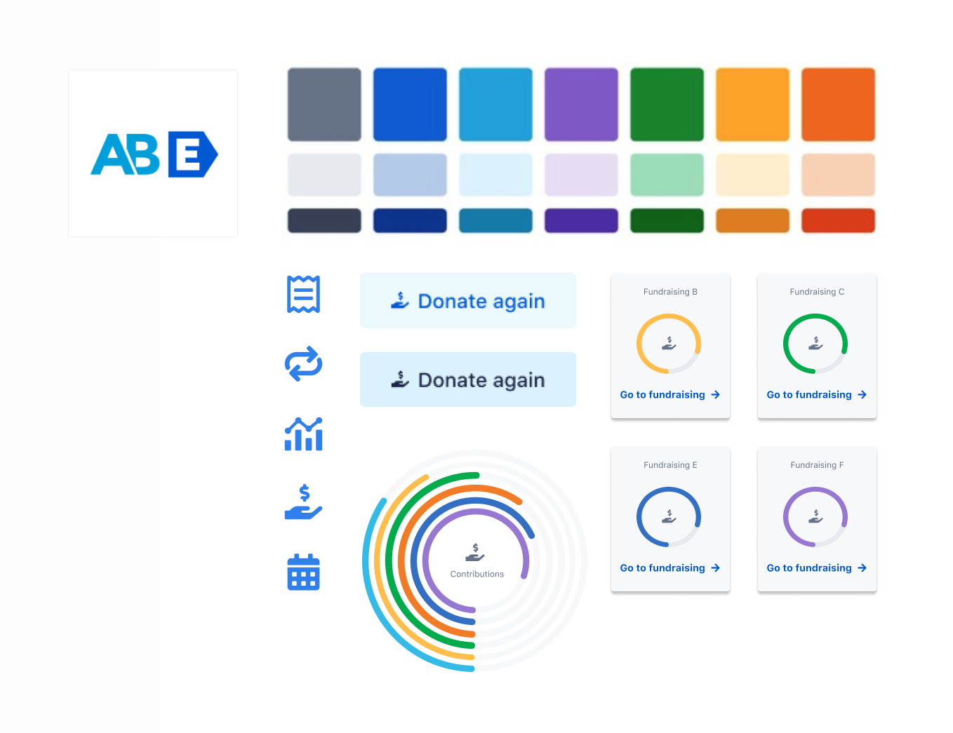
At this point, none of our products really used much color, but I took this opportunity to change that. I created new components and graphics, which were crucial to represent our donors contribution’s data in a friendly, supportive, trustworthy and enjoyable way.
USER INTERFACE
Throughout the iterations we had, there is quite a difference from our ideation concepts to my first rounds of wireframes. I wanted to make sure the new user interface was light, simple, and interactive.
Optimization Experience: I kept the date picker, but did a few updates to it, so it can accommodate to our new design. This was a good component that allowed users to view their timeline impact from any date.
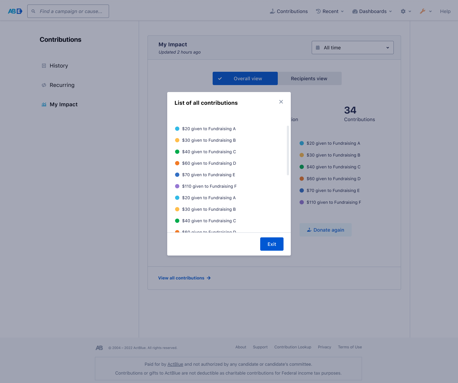
Informative Design: A list of 6+ contributions lived in this modal. This was mainly helpful for donors who had made many contributions through ActBlue.
Action Driven: People can donate to their favorite fundraisings from this point too. This created the engagement we were initially missing.
outcomes
Once we launched the new My Impact feature, 3mil+ users interacted with it. Some users analyzed their data and some made donations through this page. Our fundraisers had a monthly recurring revenue of $16K. This project was a great success, because we not only met our donors and business needs but also our secondary user which are our entities (fundraisers).
Some comments we had from our donors:
“Simple and modern UI. I can see my impact all at once.”
“Easy to understand, where my money is going.”
“I can donate directly from here!”
Mobile experience

