Brand: BiP Messenger
Project: Special Keyboard Improvement
Role: Research, wireframing and prototyping
BiP is a messaging app where people can make voice and video calls. After integrating stickers and memes to their special keyboard, the team realized their users were barely using them. After running a usability test, we noticed many people had trouble using the special keyboard. We needed to find out what the major issues were with the keyboard in order to improve and promote its use.
Challenge: Redesign the point of entrance and keyboard architecture. A functional flow where emojis, stickers and caps (memes) were accessible all at once was required. The point of entrance was very important since this was the key point to access the rest of the keyboard content.
CURRENT SPECIAL KEYBOARD
benchmarking ANALYSIS
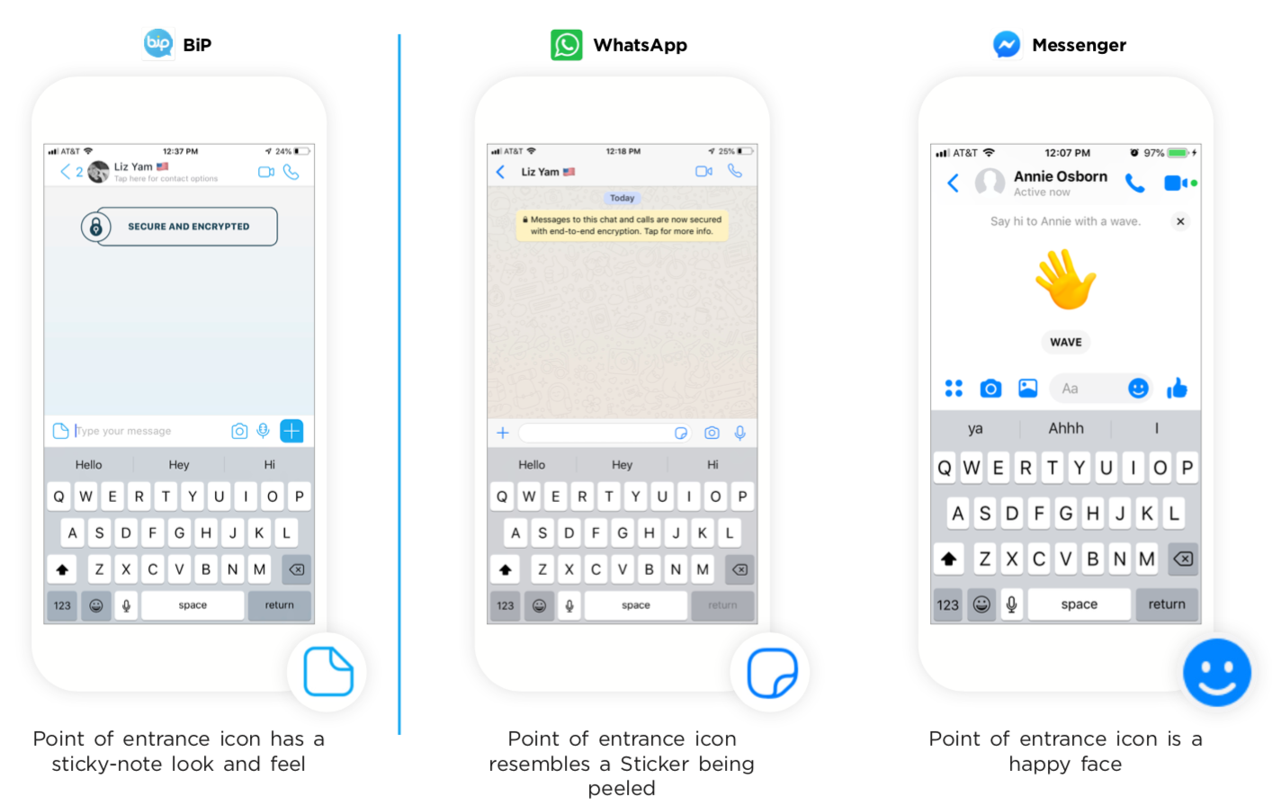
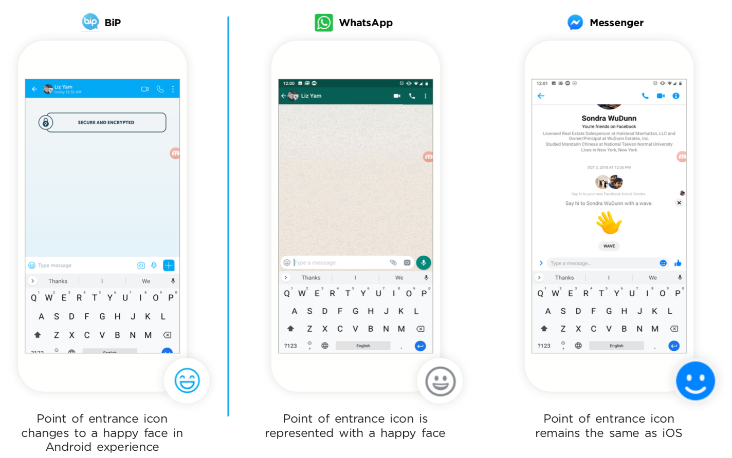
We looked at some successful special keyboard competitors such as WhatsApp and Facebook Messenger. These competitors provide similar special keyboard offerings as BiP, such as access to emojis, stickers, and caps (memes). The comparative analysis began with the POE followed by a wider analysis of each part of the keyboard.
Current Keyboard Point of Entrance Icon (iOS)
Current Keyboard Point of Entrance Icon (Android)
Analysis of point of entrance icons and its relationship and flow with the rest of the keyboard components.
Stickers comparative analysis for iOS and Android.
CAPS (Memes) and Gifts comparative analysis for iOS and Android.
wireframes
Our analysis gave us a better understanding of how a functional and engaging keyboard should be. Taking proper practices into consideration, we began sketching our ideas.
We started off with our POE and it’s connection to the other keyboard elements.
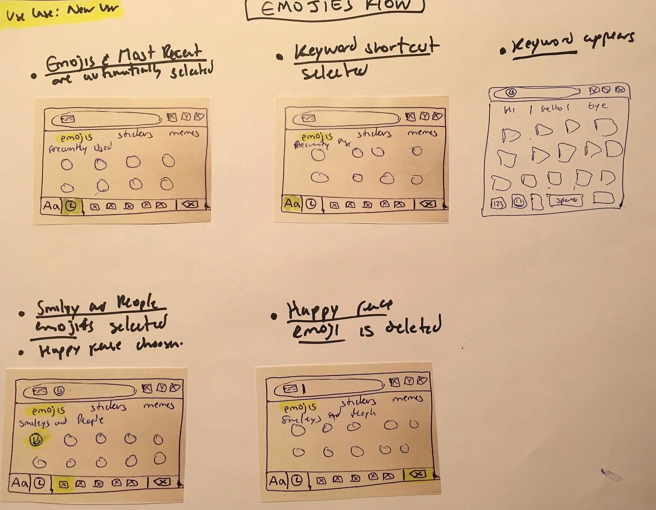
Once inside the keyboard, we began first with our emoji flow from a new user stand point.
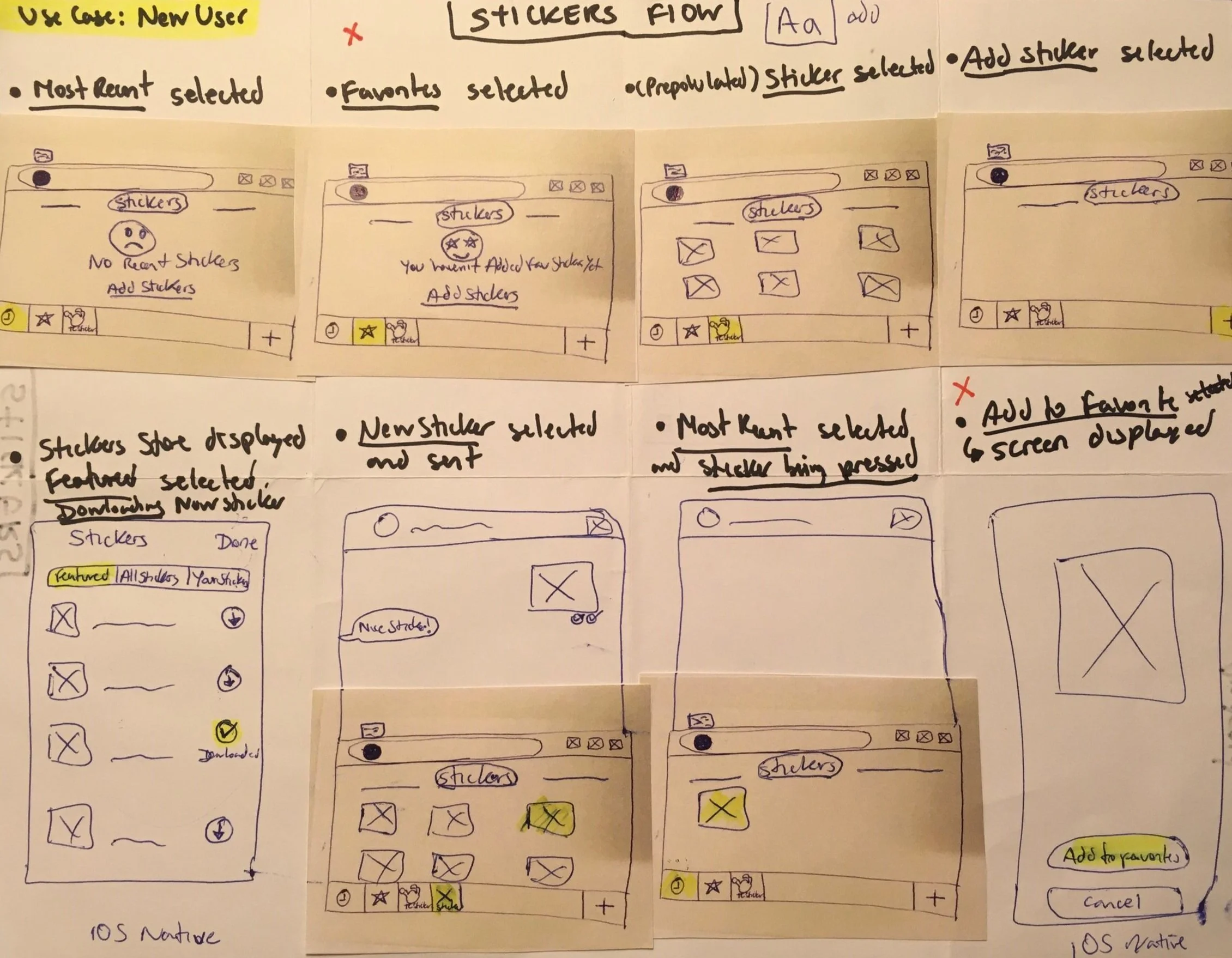
Second, we focused on the stickers flow and the content that needed to be added for certain screens, as shown below. On previously empty areas with no content, we included Add Stickers link to promote using the feature.
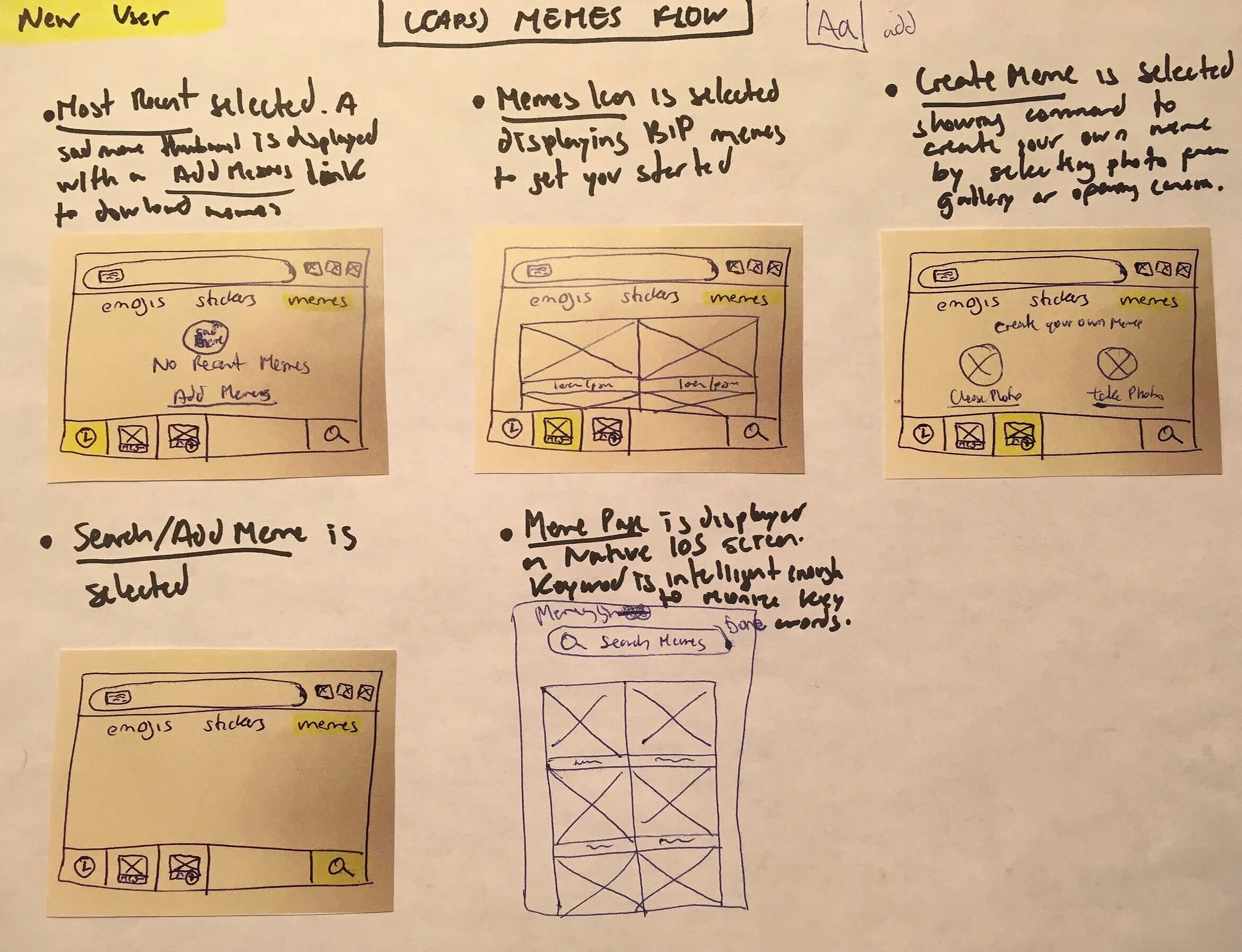
Third, we flushed out the CAPS new functionality and now renamed Memes for better recognition. Add Memes link was included for quick access to content.
Design
While creating the wireframes, we realized that it would be best to keep our POE visually consistent. Therefore, we decided to use the same icon for both operating systems - iOS and Android. This will also help our users recognize the point of entrance on any device.
Once the user taps the new POE (shown above), this one turns into a keyboard icon and provides access to the content of the special keyboard: Emojis, Stickers and Memes (previously called CAPS). All this content is accessible at once.
prototype
After a few iterations, our prototype was validated by being tested. 13 out of 13 users were able to locate the new integrations made to the special keyboard (emojis, stickers and memes). They had no confusion regarding how to get to it, and located every single feature.
Prototype made in Figma


